
Concept studied in this lecture – Visual Style.
We began this lecture by discussing what visual style meant to us.
Visual style is the aesthetics of a design/artwork and its related materials by strategically implementing images, colors, fonts, and other elements. However it does not take away from the original theme of the piece, it only enhances it.
To further study visual style and it’s components we analyzed the work of Wes Anderson – a famous movie director. When one studies his movies, it is evident that Wes has a selective colour style. Wes’s use of color blends in with the era and subdued, thus making the psychology of color in a scene to be an afterthought. He stylistically uses his color that makes a scene pop. Shruti ma’am showed us an example for this very style –

Here, we notice that this scene depicts an emotion of love between the couple – the pink hue adds to the emotional vibe of the scene.
Anderson’s work teaches us few key elements to visual styling –
- Colour – the most important element of styling. It helps to set the scene, depict the emotions and also the era/ time period of the scene. Hues are also used to depict a flashback in the scene and help differ it from the present scenario.
- Symmetry – the Layout of the frame when is in symmetry adds a sense of balance and calmness to the scene and puts all the focus on the character.
- Character ensemble – decides the entire frame setting and decides where the focus is going to be.
- Character Uniform – the costumes of a character keep changing throughout a film however a particular style sense of dressing is kept in mind to suit the personality of the character.
- Narrative and font – Anderson uses a strong narrative and supports it with a relevant font
Our assignment for the day was to re-design a movie poster using these principles. I chose Wes Anderson’s movie – the darjeeling limited, which is a movie about 3 brothers – peter, jack and francis who has recently survived a near-fatal motorcycle accident (leaving his face and head covered in bandages), and thus wishes to reconnect with his brothers on a journey of spiritual self-discovery. He is also secretly searching for their mother, whom the brothers have not seen in many years. With the help of his assistant Brendan, Francis draws up a strict itinerary for the trip and takes his brothers’ passports to prevent them from getting off the train too early. The three also continue to grieve over their father’s death: carrying bags and suitcases marked with his initials, along with other personal items that belonged to him.
I researched for the key elements from the movie and gathered them to frame a poster. I used the below posters to draw inspiration from –
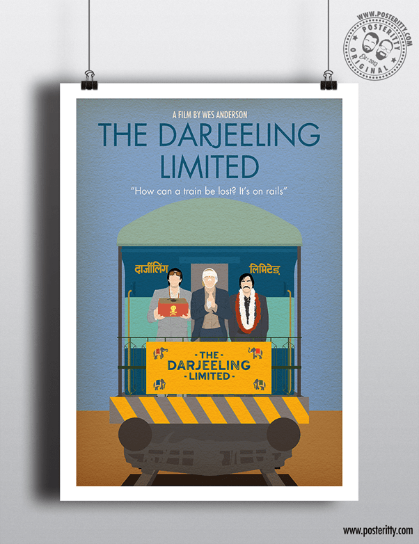
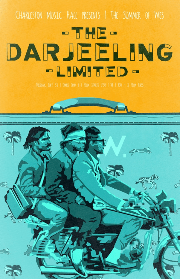
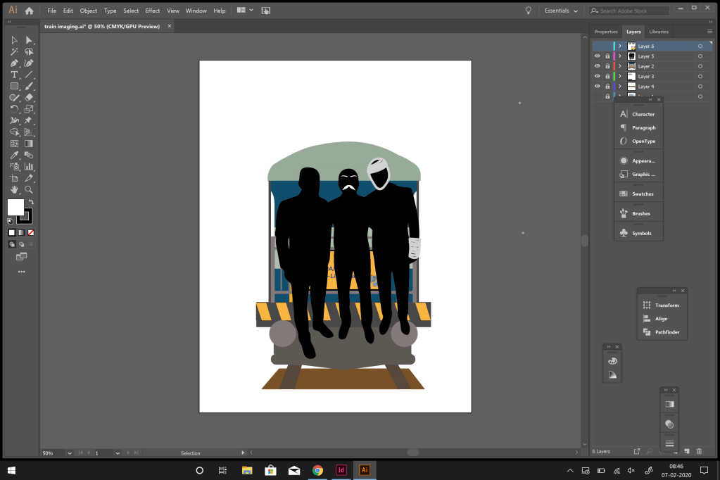
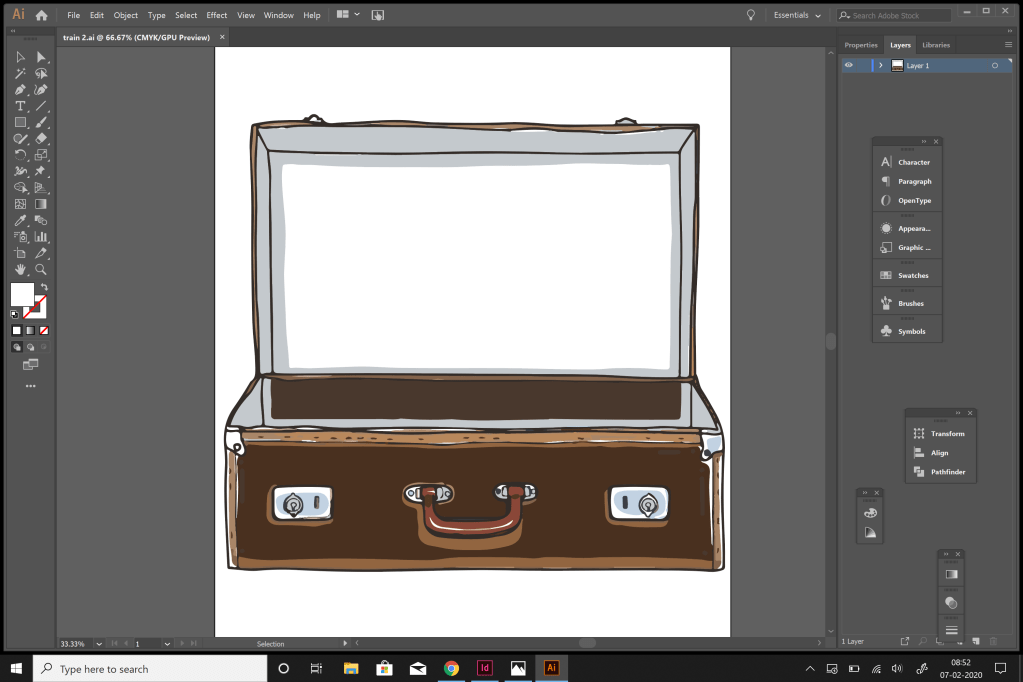
I then started to pick my elements from these and work my way through it. My basic idea was to make a poster in which the backdrop was a suitcase – depicting the one in the movie, and a train coming out of the suitcase.
REFLECTION –
This lecture really helped me understand and study the work of wes anderson, how to draw inspiration from it, experiment with various styles and tools and how anderson used a certain set of principles that he used in most of his work. All of this made my vision towards visual design a little clearer.
